What does the MindMatters App do and who should use it?
Our App is designed to allow the creation of anything from simple text shapes to complex, interactive dashboards and everything in between. So anybody can use it! A number of samples have been provided to serve as examples of what can be created. Start a new project from one of these templates and explore any feature you choose
Designs can be tailored to work on any device or screen size but we recommend using the design tools with a mouse and keyboard. Tooltips give useful hints as to many functions of the App.
What are the key features?
- Create content compatible with any device or platform capable of running a web browser. Download it, share it on Google Drive or publish it.
- Works Offline - Once you have accessed the App required files will be stored in and served from your browser cache. Diagrams can be saved locally as well as remotely. Even if your connection suffers, your work won't.
- Graphically rich animations built using the latest HTML standards - No reliance on outdated and potentially dangerous technology like flash. Future proofing your creations.
- Completely FREE to use. No account even necessary to create and download content.
- Optionally link to your Google Account to store and share data.
- Animations and Interactive diagrams without having to write a line of code.
- Ever expanding templates, samples and features. This now includes the creation of diagrams from spreadsheet templates.
Different Uses
Charts, Data and Dashboards
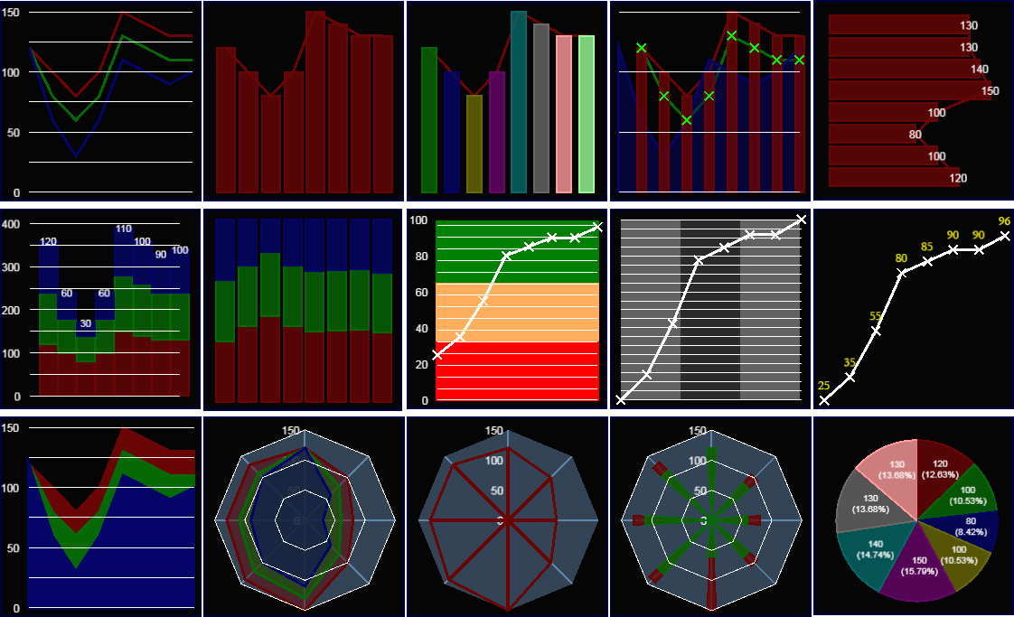
It's possible to create any classic chart in Mindmatters. A data series can be shown as an area, line or you can use inbuilt markers (like bars) or custom images.
This image shows a sample available in the app. You can use any of the charts as a starting point for your own creations or, to start from scratch, simply add a chart object to any shape in your diagram
Showing Quality Ranges or Key Performance Indicators
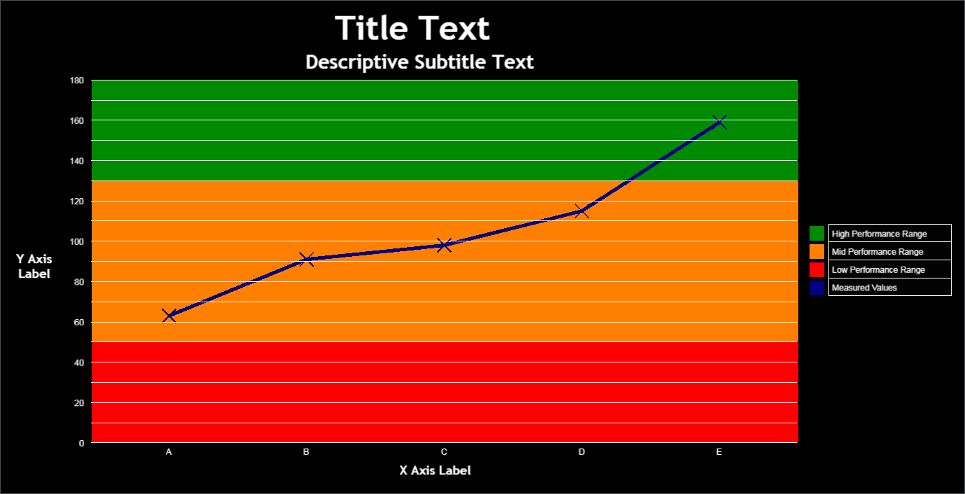
This chart shows a line series with markers against a stacked area plot representing a classic traffic light configuration used in quality monitoring and for key performance indicators.
Reading data from a spreadsheet, data sources and ranges can be quickly switched providing a continously reusable template for reporting and analysis.
Enhancing Visuals with Images

It is possibly to combine images and charts to enhance the impact but it's also possible to use images directly as chart markers.
Enhancing the Impact with Animation

With simple custom commands it is possible to animate a wide range of shape properties in the App and charts are no exception.
This Coronavirus Infographic animates the flattening of the chart curve by changing all data points over a (user defined) time period. In conjuction labels and lines and shown and hidden to explain the purpose behind flattening the pandemic curve. Something with which the entire world is now familiar!
Create Interactive Dashboards
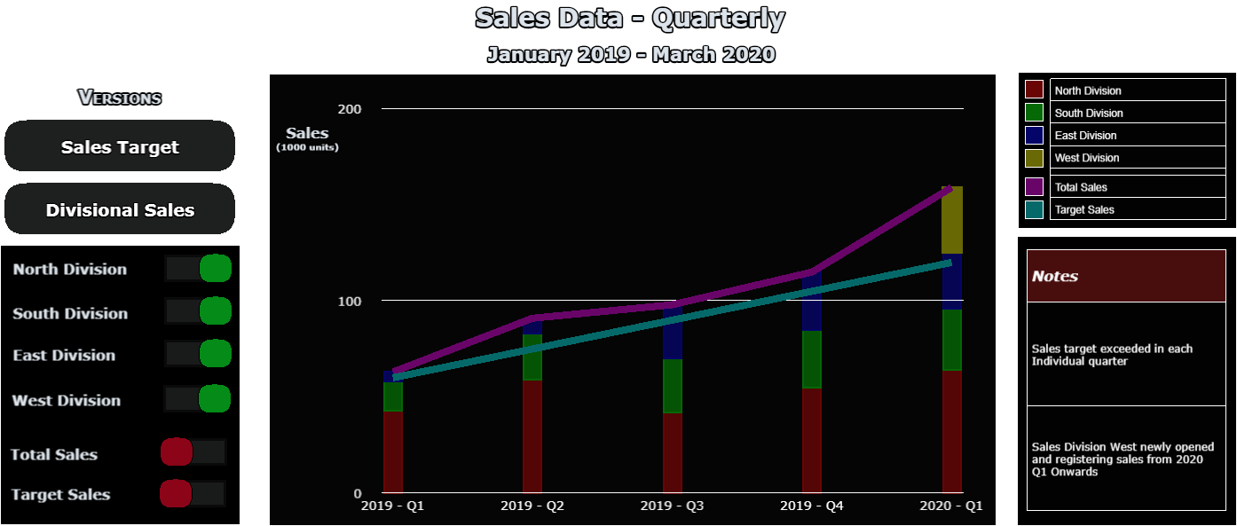
With interactivity and the custom command system it's possible to build sophisticated, interactive and animated dashboard templates that can be attached to spreadsheet data.
You could circulate a link to stakeholders or present live in a meeting. Interactive shapes are entirely hosted in a web browser and so work seamlessly with a variety of screen sharing applications.
This fully interactive example allows you to switch between a Sales and Customer Satisfaction presentation, add and remove Chart series, switch between charts and shows how table highlighting can be dynamically linked to flowcharts.
Additional controls allow users on smaller screens to zoom in and out of individual elements.

Spreadsheet driven designs
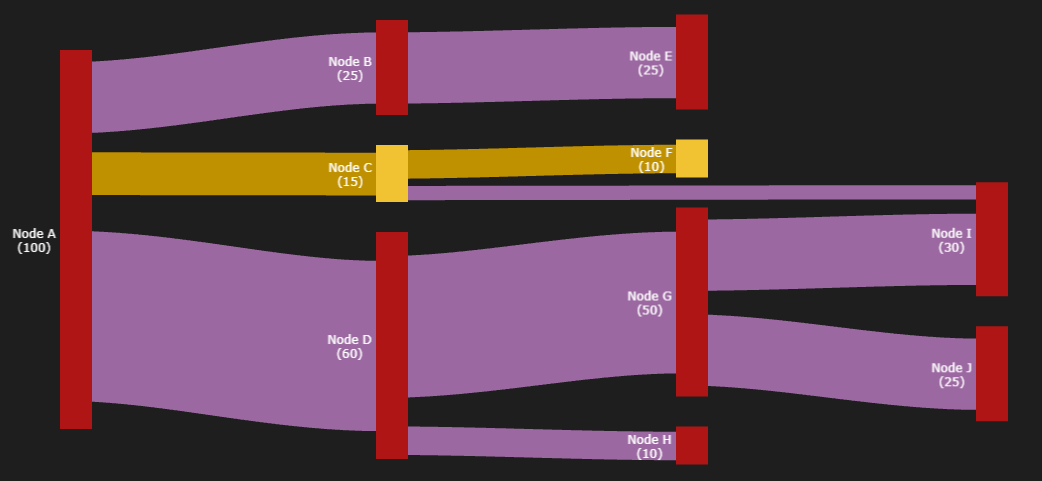
Use wizards to create diagrams directly from spreadsheet templates. The Sankey Flow Template allows for the creation of custom Sankey Flow data visualisations.
With the template designers can take full control. Adding as many nodes and connections as required with full control over labelling, colour and font.
Diagrams created from Spreadsheet templates are, of course, fully editable after creation.

Create a fun quiz for the family, by providing questions and answers on the Quiz Template spreadsheet.
The Wizard will create shapes for the questions and answers as well as effects and commands that allow users to answer, reset and navigate the quiz as well as keeping track of their score.

Display Slides or Infographics
Enhancing visuals with Effects
You can create buttons and button like elements in your creations that respond to input and one simple way is to use a predefined filter effect. At present the basic types available are; shadows,outline,blur and glow. You can create as many variants of these as you require; ie differing glow intensities or outline colours.
This example shows how an image of red, green and amber circles can be tinted (to make them appear like traffic lights turned on) and then made to glow to show the opposite.
Buttons in the control panel (Stop and Go) show a simple animation of a UK traffic light sequence to show what is possible with custom commands.
OPEN IN NEW PAGE
Making Effects Interactive
Effects can be assigned to shapes or shape elements. If not persistent they can also be assigned to user interaction states; hovering (mouse over) and clicking or pressing.
The "camera position" of this diagram can also be adjusted by dragging the background.
OPEN IN NEW PAGE
Commands can also be assigned to a shape's interactive state. Dozens of properties can be changed and all numerical, changing properties can be animated.
The "camera position" of this diagram is fixed.
OPEN IN NEW PAGE
It's even possible to change whether or not individual shapes, in your created diagrams, can be dragged and dropped.
In this example, buttons have been added to the control panel to allow camera movement.
OPEN IN NEW PAGE
Creating Interactive Presentations
Heartbeat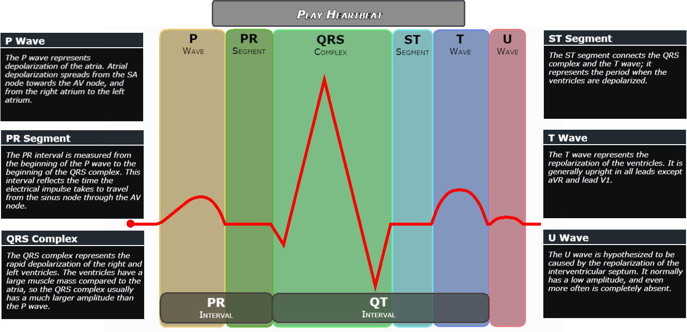
This Infographic represents the breakdown of a heartbeat as recorded on an ECG. Hovering over the description highlights the relevant area and a simple animation enhances the heartbeat line.
Adding Camera movement and User Input

By making the most of effects and interactivity we can create something not only visually effective, but also practical to use. The interactive version of this SWOT Analysis uses effects to start a special interactivity mode. Data can then be entered in real time giving practical use in the boardroom or the classroom or in screen sharing meetings.
Users can zoom in our zoom out by clicking the different areas of the analysis. A button on the control panel gives a simple way to return to the main view.
Flowcharts, Mindmaps and Organizational Charts
Make interactive decision trees with a few quick menu selections. With the root node select, follow a decision path to a termination path.
OPEN IN NEW PAGE
Or more open Mindmaps. Click on any branching idea or detail to navigate around the Mindmap or the central idea to return to the starting point.
With the Mindmatter default setting the screen is also set to "dragable" so the diagram can alternatively be navigated by clicking and holding the background.
OPEN IN NEW PAGE
Other miscellaneous uses
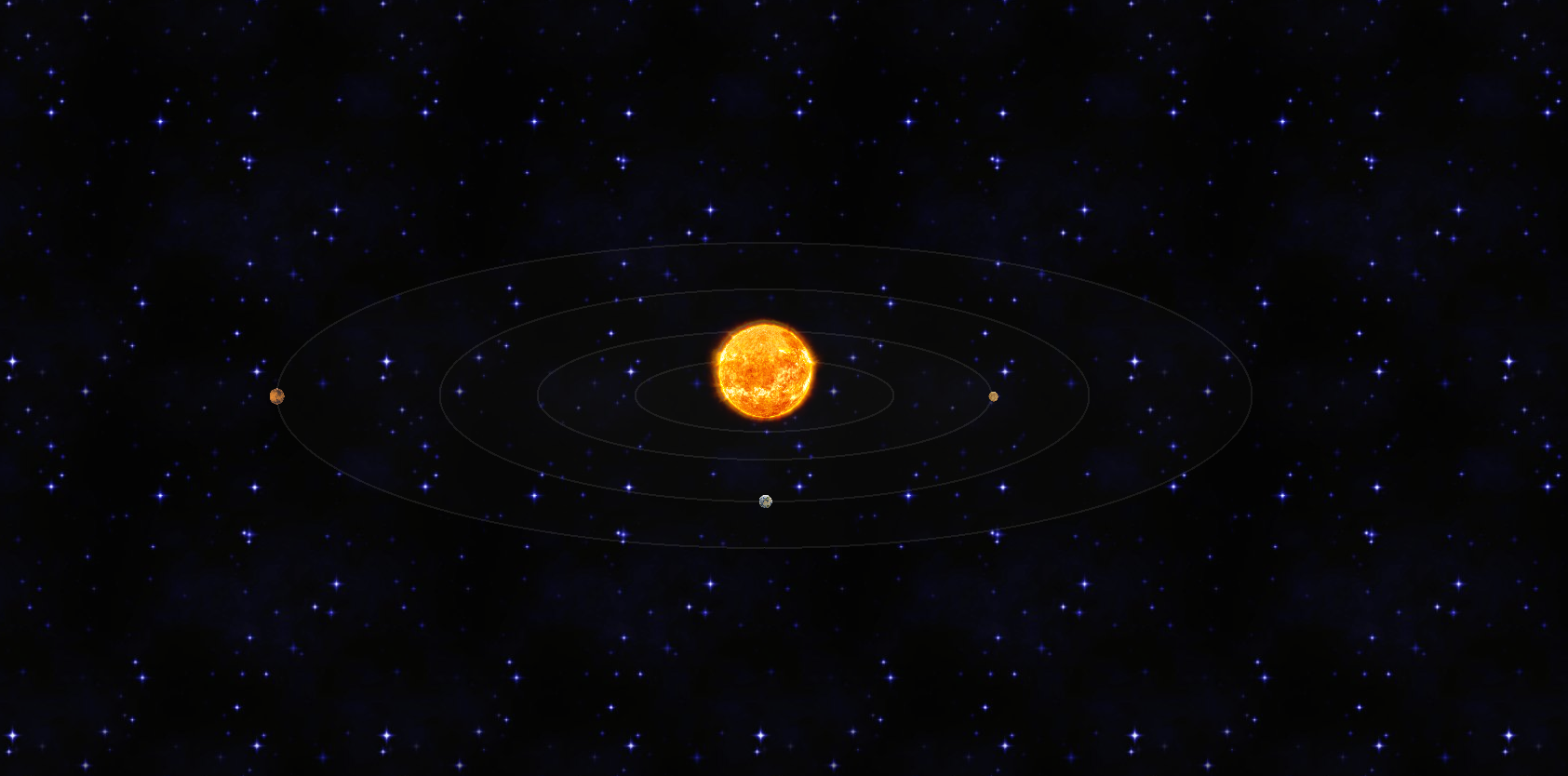
Animations work seamlessly together by running at the exact same frame rate depending on your device and browser capability. This diagram of the Inner Solar System shows that animation with the orbit of the planets around the sun.
Although object sizes are not to scale, the orbital distance and speeds are.
